Uptown
Playing Up the Pride for a North Side Neighborhood
The Challenge
Despite being one of our fair city's most iconic neighborhoods, Uptown had long lacked a cohesive identity. Each sub-neighborhood had it own distinct flavor, and with recent growth came concern that Uptown’s history might be lost.
THE OUTCOME
Introduced in Spring 2017, the new brand identity celebrates Uptown’s rich sense of culture and contrasts. It is both vibrant and worn-in, simple yet flexible. Like Uptown itself, the system is resilient, designed to stand the test of time.
RESEARCH & DISCOVERY
How might we rally Uptown’s many diverse constituents around a single, unifying brand? To find out, we took to the streets and social media, surveying community members and visitors to learn firsthand what makes Uptown so unique.


Diversity Wins
Asked to rate factors like lakeside location, landmark architecture and killer food, 132 survey respondents overwhelmingly cited its diversity as Uptown's greatest benefit and strength.

BRING IT ALL TOGETHER
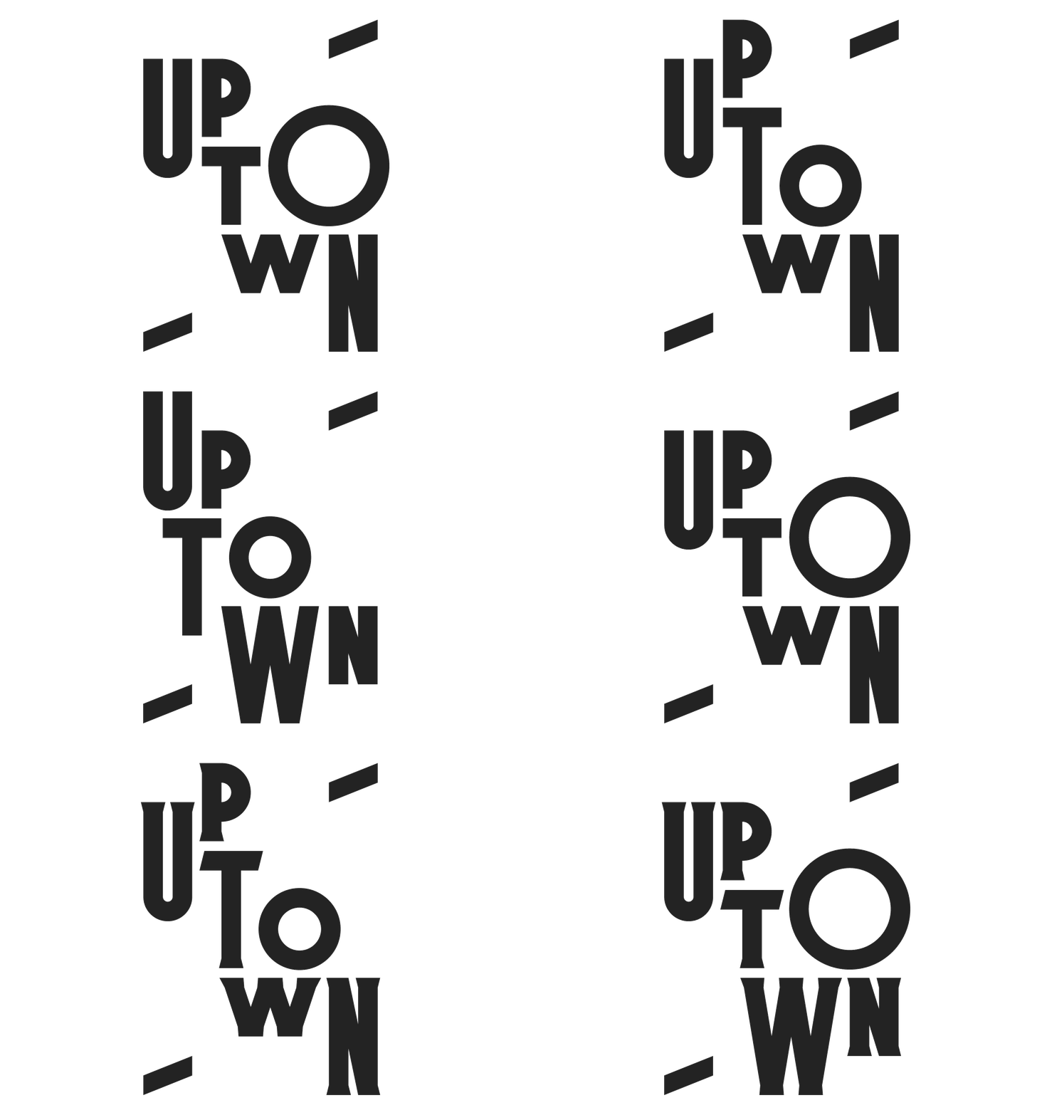
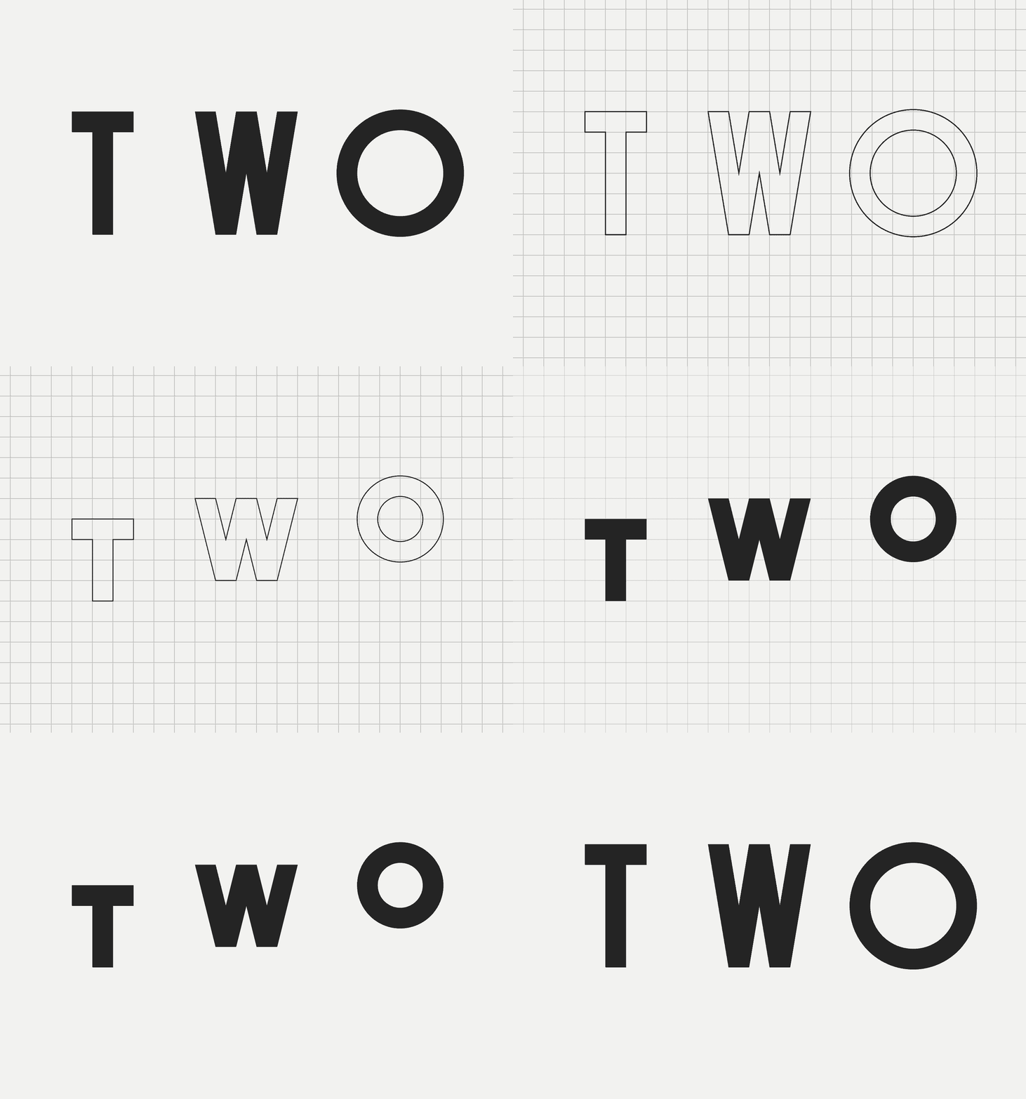
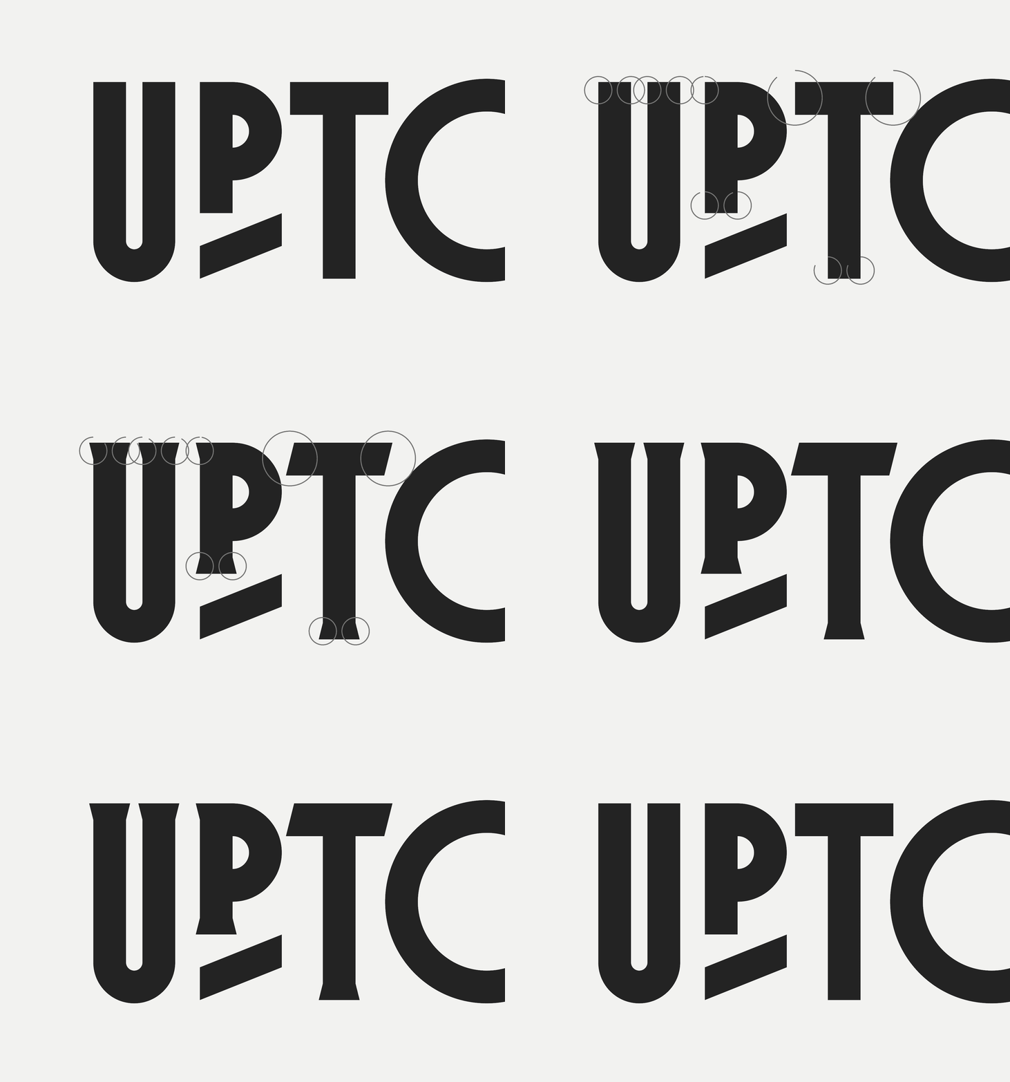
It was critical that our work capture Uptown’s exuberant energy, surprising intersections and rich contrasts—its realness. We developed an adaptable system, anchored in three core elements: a custom alphabet, modular grid and vibrant color palette. They combine in brilliant and dynamic variations, perfect for representing Uptown’s sub-neighborhoods, while maintaining an overall unified look and feel.


FRAME IT UP
A minimalist mark, an upward angled bar, is our common thread. While the font or palette may vary from one block to the next, the mark holds steady. Simple and symbolic, it's a subtle nod to Uptown’s persisting strength, integrity and bright future, while serving double-duty as a handy framing device.

Mix it Up
The alphabet comes in both serif and sans serif fonts, with special language characters included. It allows for an historic, legacied feel where appropriate, or a more modern vibe as needed.


FRAME IT UP
A minimalist mark, an upward angled bar, is our common thread. While the font or palette may vary from one block to the next, the mark holds steady. Simple and symbolic, it's a subtle nod to Uptown’s persisting strength, integrity and bright future, while serving double-duty as a handy framing device.


CUSTOM UPTOWN ALPHABET
LIVE IT UP
Since wrapping up our work together, the Uptown community has made the brand its own—a sign of success if ever there was one. New events, long-time festivals, small business initiatives and local groups have joined the fold, working within the system to create their own marketing materials and with them, a new sense of pride and shared purpose.


Loud + Proud
The new brand can be spotted about town, on earth-friendly totes (great for the Night Market!), festival flags and adaptable business cards, customized for the fine folks at Uptown United, the organization charged with preserving and promoting neighborhood pride.


RAISE IT UP
The final touch—a suite of street banners, each unique in its color/type combination—demarcate each of Uptown's celebrated sub-neighborhoods. Together, they create a stronger-than-ever sense of place for the small lakeside community with a whole lot of spirit.


